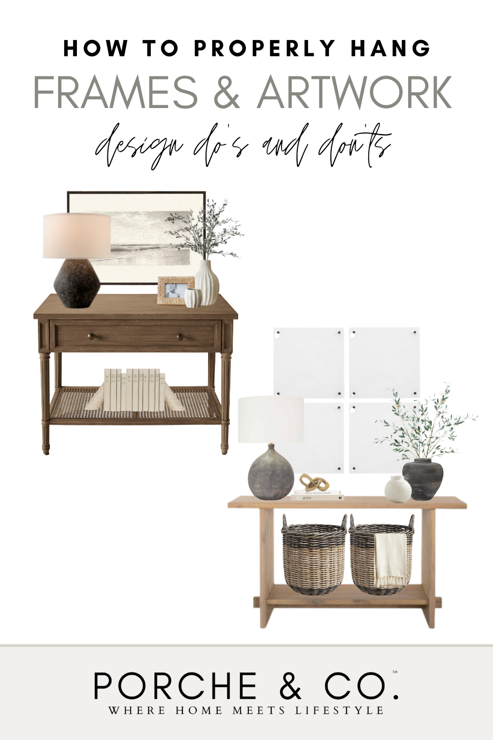
Porche Tips & Tricks: How to Properly Hang Frames & Artwork
How to Properly Hang Frames & Artwork :: Porche & Co. Tips & Tricks
Today, we are excited to be bringing you a “how-to” on a topic that we get asked questions about all of the time! What artwork would fit best in this space? How many frames should I hang on this wall? How high should I hang the artwork? Choosing artwork and then hanging it can be difficult tasks to get just right — but we are here to provide you with some helpful and simple tips to keep in mind when doing so!
Design Do’s & Don’ts :: Tip 1
When hanging a piece of artwork, the frame should be about 3-6” above furniture so it doesn’t give the illusion that it is ‘floating’ in the air. This is a common mistake we see often in homes — artwork or decor being hung too high and not feeling cohesive with the rest of the furniture. To avoid this, aim to hang the art only a couple of inches above to feel grounded with the furniture!
Design Do’s & Don’ts :: Tip 2
Another rule of thumb to remember when hanging a piece of artwork is for the center of the art to be at eye-level, or roughly ~60 inches from the floor. This is because you want the piece of art to really create a focal point for the space and be aesthetically pleasing to the eye, instead of having to look up or down.
Design Do’s & Don’ts :: Tip 3
Another question we get asked all of the time is how to hang multiple frames or a ‘gallery wall’ of frames. When hanging multiple frames, you want them to look intentional and cohesive, even though you are using different photos or pieces of art in them. In order to create a cohesive gallery wall of frames, hang them 1-2” apart from one another. This way, they don’t look disconnected from each other and it creates a really cohesive, focal point on wall.
Design Do’s & Don’ts :: Tip 4
One of the biggest design mistakes we see all of the time is not having a large enough piece of art or decor over large furniture! A rule of thumb to follow is for the art (or grouping) to be about 2/3 the width of the furniture it’s going over. This is more pleasing to the eye and creates a large focal point that is to scale with the furniture below it!
Design Do’s & Don’ts :: Tip 5
Don’t be afraid to bring in multiple frames or pieces of art to create a more unique look! When doing so, make sure to treat the grouping of frames/art as one. You will want to hang the center of the grouping (wherever that may be within the grouping) at eye level, or roughly ~60 inches from the floor. When picking out art to go together, find pieces that have similar tones that will look cohesive together. For a more eclectic and less formal look, you can use different finishes or types of frames for the art!
Be sure to “Follow Us” to stay up to date on everything Porche and Co. & The Porche Place!
**This Post Contains Affiliate Links**
Do you love what we did with this space? Do some rooms or spaces in your house need some designer help but you aren't sure how to get started?
Check out our various Packages through the link below & let's get started designing your dream room(s) today!
Follow these 3 easy steps to get started today:
1. Select the E-Design package from that best works for your design needs
2. Complete the short Client Design Questionnaire on each space
3. Sit back and watch your dream home come to life!
You will have direct access to your Porche & Co. designer through messenger throughout the whole process.
Multiple revisions are included with each package to ensure you are completely happy with the end result!


