How to:: Style Your Console Tables
How to:: Style your console table
Today, we are sharing another design “How To” with you — console table edition! We’re so excited to share tips and tricks for styling your console table. Styling this space can be overwhelming, daunting, and difficult to get ‘just right’. But we have some tips to go by that will help you get your console table styled and beautiful! Our goal here at Porche & Co. is to ensure that everyone is able to tackle the styling of their console tables and be able to do so in their own personal way!
To give you some design inspiration and ideas for your own space, we have rounded up a few of our favorite console tables styled in different and unique ways! Which option suits you and your space the best?!
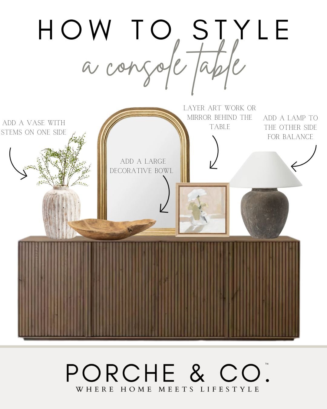
When beginning to style your console table, keep in mind your space and what style of table and decor would fit best. Maybe you have a larger space and need a bigger console table to fill the room. Maybe your space is a bit smaller… a mirror above the table can help make the space appear larger and brighter. Also keep in mind the rule of three. Groups of threes are very pleasing to the eye, so try to create little vignettes and groupings in threes (ex. three vases of varying heights or a stack of two books and an object on top). We also like to stick to neutral color tones while adding pops of color with faux plants and greenery to keep the space bright and full of neutral texture and dimension.
Console Table Styling :: Option 1
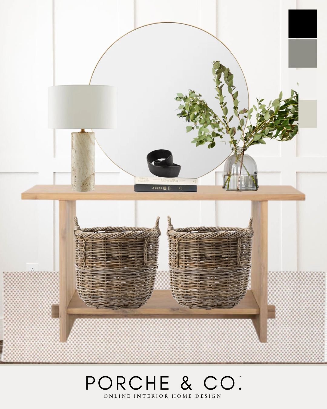
For this Modern Classic console table design, we started with this neutral simple console table as the foundation. We added a simple mirror above the table. We balanced each side with a large, neutral table lamp and an oversized, clear vase with faux stems. We added some simple decor in the middle, a stack of books, and a black metal knot.
Tip 1: A perfect way to ground the space underneath your console table is with baskets if the space allows. Not only do they add balance to the space, but they also bring function by providing storage and perfectly hiding all of the things!
Tip 2: Adding a mirror above a console table is a great way to make your space feel larger and brighter. Mirrors reflect natural light which can effortlessly make your space appear bigger than it really is!
Tip 3: Books are great to stack on your table as a simple way to add functional height and dimension. We also love to stack a bowl, pot, vase, or decor piece on top of books to add dimension & varying heights.
Console Table Styling :: Option 2
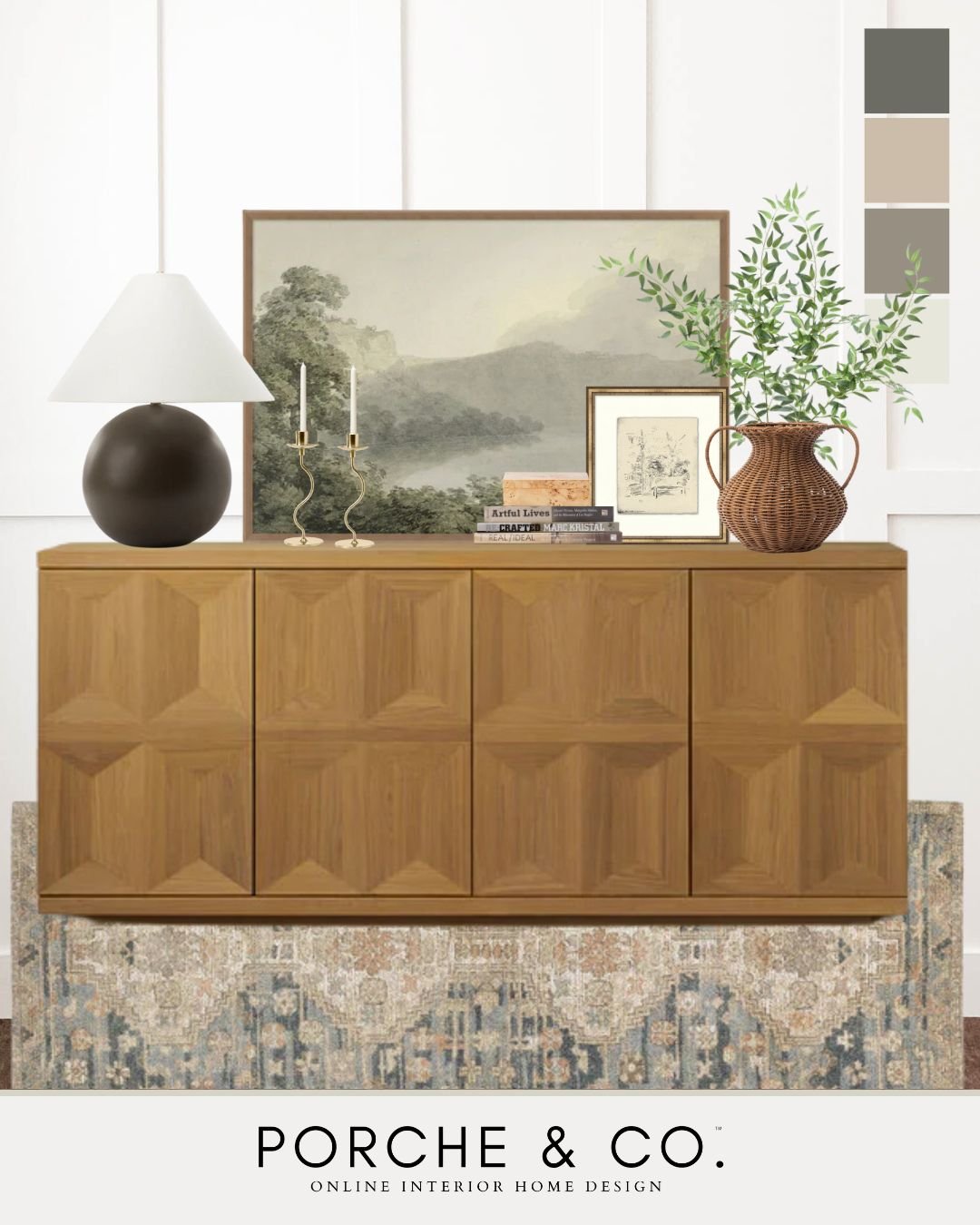
Another great console table option is choosing one with cabinets, like this Modern Classic one above. Cabinet console tables are a great pick if you need some extra storage in your space! This table sits lower to the ground, so we balanced the space above with a large, oversized piece of artwork layered with a smaller one. On one end, we added a dark table lamp to add some contrast in color. On the other end, we added a large textured vase with tall faux stems. We brought in some layers, color, and dimension with the framed piece of artwork, textured box, a stack of books, and a set of candle sticks.
Tip 4: Add layered artwork to your console — it is such a nice solid backdrop behind other decor pieces, creates a cohesive focal point, and adds color to your space! Grab some of your favorite framed prints or paintings to layer behind items. This is also an easy way to switch up decor pieces in various seasons… try adding dark and moody artwork in the fall and winter, and bright and lively artwork in the spring and summer.
Tip 5: Adding a lamp to one end and a vase with faux stems to the other is the prefect way to balance out your table and add some height and texture!
Console Table Styling :: Option 3
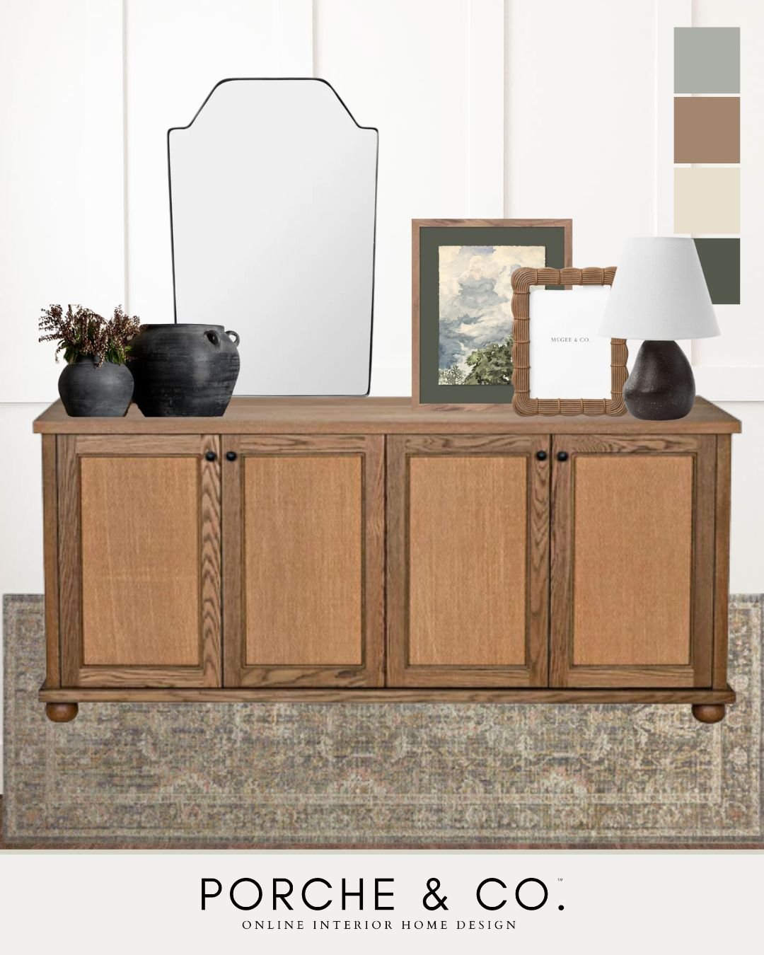
This console styling is light yet moody, loaded with different textures and dimension! Instead of a gallery wall or large piece of art work, we opted for a mirror on one side and a layered artwork look on the other above this neutral, textured console table. We grounded the space with a beautiful runner! We balanced this space with a dark smaller lamp on one side, and a set of dark vases with faux stems on the other side. . We added a fun textured frame to one piece of artwork for another layer and interest! This console table is beautiful and simple and has a vintage look we didn’t want to over crowd it with decor. We love how the darker pieces provide needed contrast, but the neutral color tones keep the space bright and full of texture and dimension!
Tip 6: Decorative objects will add additional dimension & layers. Choose objects of varying heights, colors, and textures to create depth and interest. Candles, jars, pots, vases, uniquely shaped objects, and beads will provide loads of added texture.
Tip 7: We love adding realistic faux greenery to console tables. These faux stems create such a nice warm focal point in this space, and also serve to add varying height! We are firm believers that greenery and florals always help create an inviting and welcoming feel!
Be sure to “Follow Us” to stay up to date on everything Porche and Co. & The Porche Place!
**This Post Contains Affiliate Links**
Do you love what we did with this space? Do some rooms or spaces in your house need some designer help but you aren't sure how to get started?
Check out our various Packages through the link below & let's get started designing your dream room(s) today!
Follow these 3 easy steps to get started today:
1. Select the E-Design package from that best works for your design needs
2. Complete the short Client Design Questionnaire on each space
3. Sit back and watch your dream home come to life!
You will have direct access to Emily through messenger throughout the whole process.
Multiple revisions are included with each package to ensure you are completely happy with the end result!


