
Porche Tips & Tricks: Our Favorite Moody Black Paint Colors for your Interior
HERE AT PORCHE & CO. WE TRULY BELIEVE IN THE IMPACT THAT PAINT CAN HAVE ON A SPACE. IT CAN COMPLETELY TRANSFORM A ROOM AND CREATE A COHESIVE STATEMENT WITHIN A SPACE.
TODAY, WE’LL BE SHARING OUR FAVORITE black paint colors. We will also relay our favorite tips WHEN IT COMES TO UTILIZING THESE DARK, MOODY blacks IN YOUR HOME. THE USE OF black PAINT on the interior of a home IS DEFINITELY ON THE RISE. It CAN ADD A BEAUTIFUL RICHNESS and contrast to a space, BUT IF USED IMPROPERLY, black CAN OVERWHELM AND darken a space way too much. KNOWING if black paint is a good fit for your space CAN BE TRICKY, BUT DON’T WORRY IT’S NOT AS OVERWHELMING AS YOU MAY THINK.
We typically do not recommend utilizing black unless your space has a good amount of windows and natural light. Remember black absorbs light so you’ll need to have a good amount of it coming into a space for your space to still feel bright enough highlighting the contrast throughout the space. if you paint a room black that does not have ample natural light, it will feel depressing and cavelike. You can compensate for a lack of natural light and windows using light paint colors- think whites not blacks!
As with any paint, SAMPLING IS GOING TO BE A VERY IMPORTANT PART IN THE SELECTION PROCESS. IF YOU’VE BEEN FOLLOWING ALONG WITH Emily’s master bedroom RENOVATION, YOU KNOW THAT WE TRULY BELIEVE IN SAMPLING- IT IS SO IMPORTANT! IT REALLY ALLOWS YOU TO SEE THE PAINT COLOR IN THE ROOM AGAINST THE OTHER SURROUNDINGS AND HOW THE LIGHT HITS IT. This even holds true for blacks as they all have very different undertones and can look extremely different in your space. IT iS ALSO IMPORTANT TO LOOK AT YOUR SWATCHES AT DIFFERENT TIMES THROUGHOUT THE DAY, SO YOU CAN TRULY GET A FEEL OF WHAT THE COLOR WILL LOOK LIKE IN THE SPACE.
below, you can see emily’s paint samples for her master bedroom renovation! she will be sharing more on instagram, so be sure to follow along there!


THERE ARE DIFFERENT WAYS TO APPROACH USING A dark PAINT COLOR. WE LOVE INCORPORATING THEM ON A SINGULAR ACCENT WALL. SELECTING ONE WALL IN THE ROOM TO PAINT A MOODY COLOR AND THEN SURROUNDING THE DARK ACCENT WALL WITH LIGHT OR WHITE WALLS CREATES AN EYE CATCHING FOCAL POINT WHILE ALSO DIFFUSING THE BOLDNESS OF THE DARK PAINT COLOR. IT CREATES SUCH A BEAUTIFUL FOCAL POINT WITHOUT MAKING THE SPACE FEEL TOO DARK. TRY ADDING SOME TRIM WORK (SHIPLAP, WAINSCOTING, ETC) TO ADD TEXTURE TO THE ACCENT WALL AS WELL. A dark COLOR CAN DEFINITELY BE USED TO PAINT ALL THE WALLS IN A SPACE, BUT remember, be SURE THAT YOU HAVE ENOUGH NATURAL LIGHT THAT FLOWS INTO YOUR SPACE OR IT CAN FEEL DARK AND DEPRESSING.
We hope that our guide to choosing the perfect black paint color helps in your decision making process! Always, always remember to sample. You might not want to spend the money, but sampling can save you from a costly mistake of re-painting in the long run. We love ordering various peel & stick samples from SAMPLIZE.COM. Test your samples at different times of day, in various rooms of the house, against your trim/cabinetry paint and against your floors. These can all alter the look of THE paint, so be sure to take all factors into account. You cannot sample too much in our opinions! If you are considering multiple blacks, paint them all beside each other in various places in your room (as well as beside your trim!)
in black rooms, consider painting windows and trimwork black as well for cohesion. leaving the trimwork white will create contrast, so decide if you are going for contrast or cohesion.
Whatever you do, PLEASE do not go off of photos that you see online of certain colors. All colors look different on computer screens and have different editing applied to them. They will not look the same in your home, so definitely keep that in mind and use samples instead.
When choosing sheens for your Black paints, we often recommend Flat or Eggshell for standard (non-bathroom) walls with Satin in Bathrooms. On millwork and cabinetry, we often use Satin. Semi-Gloss is also popular to use on trim work.
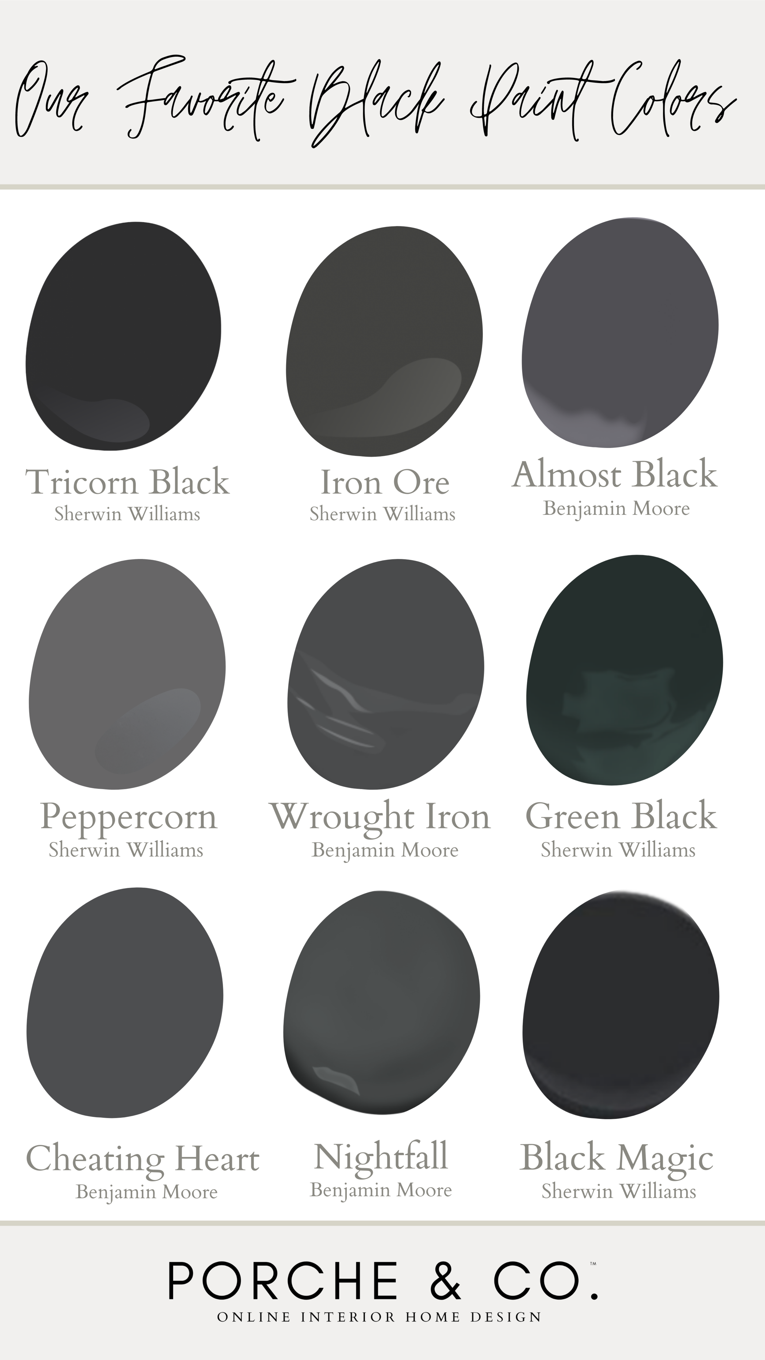
Below we’ve listed some of our favorite BLACK paint colors along with a description of each color!
Tricorn Black by Sherwin Williams
TRICORN BLACK IS A RICH, SATURATED TRUE BLACK. IT DOESN’T HAVE ANY STRONG UNDERTONES, SO IT WILL PAIR BEAUTIFULLY WITH NEARLY EVERY OTHER SHADE. IT IS A SIMPLE, YET ELEGANT. THIS LUSH COLOR WILL MAKE A BEAUTIFUL STATEMENT IN ANY SPACE.
Green Black by Sherwin Williams
THIS COLOR IS A MODERN MIX OF BOTH BLACK AND GREEN WITH UNDERTONES OF BLUE. THIS IS SUCH A UNIQUE COLOR THAT CAN BE FUN TO USE IN OFFICE SPACES OR OTHER INTERIOR WALLS.
Black Magic by Sherwin Williams
THIS IS A SOFT BLACK LOOKS BEAUTIFUL IN ANY SPACE. IT IS A TRUE BLACK WITH NO DISCERNING UNDERTONES. IT WOULD PAIR NICELY WITH LIGHT AND BRIGHT NEUTRAL SHADES AND ACCENTS THAT WOULD ALLOW IT TO STAND OUT AND PROVIDE A FOCAL POINT TO THE SPACE.
Almost Black by Benjamin Moore
This smooth bold color is beautfiul in any space. it is a medium dark shade with cool blue undertones. It is a simple, yet elegant “almost” black.
Wrought Iron by Benjamin Moore
this black offers more soft and muted tones when compared to a true black. it has navy undertones. Wrought iron adds warmth to the space.
Iron Ore by Sherwin Williams
Iron ore is a dark rich paint color. it is one shade lighter than tricorn black, but a few shades darker than peppercorn black. it offers an intense charcoal color with gray and blue undertones.
Peppercorn by Sherwin Williams
peppercorn is described as a very dark transitional gray. it is a complex color because it is not dominantly warm or cool but has a balance of both undertones. it will complement other colors within the space nicely and leave a timeless look that looks great in any room.
Cheating Heart by Benjamin Moore
cheating heart is slightly less reflective than a true black while providing the same tones and shades of a moody black. This paint color is great for interior spaces, trim, walls and cabinets. This color provides a crisp color that does not appear too stark.
Nightfall by Benjamin Moore
Nightfall is classified as more of a blackened gray color that contains faint blue tones. This color is a great compromise between a true black and a dark gray because it is softer than a pure black paint color but not gray or beige.
Happy Black Paint Hunting! Take a deep breath…pick your favorites, grab the samples, test everywhere and be confident in your decision. You’ve got this!!
Be sure to “Follow Us” to stay up to date on everything Porche and Co. & The Porche Place!
**This Post Contains Affiliate Links**

Do you love what we did with this space? Do some rooms or spaces in your house need some designer help but you aren't sure how to get started?
Check out our various Packages through the link below & let's get started designing your dream room(s) today!
Follow these 3 easy steps to get started today:
1. Select the E-Design package from that best works for your design needs.
2. Complete the short Client Design Questionnaire on each space.
3. Sit back and watch your dream home come to life!
You will have direct access to your designer through messenger throughout the whole process.
Multiple revisions are included with each package to ensure you are completely happy with the end result!

